How we gave a 230-year-old brand its visual confidence back
WHSmith PLC |. Retail & Travel |. Brand Strategy & Identity |. 2025
"Visual confidence restored. Heritage intact."
Case study 01 · Brand strategy & identity
A data-led brand strategy for one of Britain's most iconic retailers. Market analysis, audience segmentation, brand mission, and a visual identity refresh that honoured 230 years of heritage while rebuilding the distinctiveness and trust the brand had been losing. Tagline: Trusted Quality, Every Time.

The challenge
WHSmith has been a fixture of British life for over 230 years — books, stationery, convenience, always there when you need it. But trust built over generations does not protect a brand from decline. Between 2022 and 2024, WHSmith's market capitalisation fell from £2.15bn to £1.75bn — a 15% drop in two years. The data told a story the brand couldn't ignore.
The problems were structural and visible. Store environments were widely perceived as cluttered and outdated. The online proposition was attracting consistent negative reviews, with customers citing a confusing and frustrating e-commerce experience. And a recent rebranding attempt had backfired publicly — the new identity drew widespread criticism for its resemblance to the NHS brand, sparking social media backlash and deepening the sense of a brand disconnected from its own audience.
WHSmith didn't need a cosmetic fix. It needed a brand strategy that could honour 230 years of heritage while making the brand feel relevant, trustworthy, and distinctively itself again.


The craft
The strategic starting point was the same question every rebrand should begin with: what does this brand uniquely own that no competitor can claim? For WHSmith, the answer was clear — its name. Not a symbol, not a colour, not a strapline.
The word-mark itself carries 230 years of embedded meaning: heritage, reliability, presence. The previous rebrand had tried to move away from this. The strategy here was to double down on it.
Before touching a single design element, the work began with a rigorous market analysis and audience definition. Three distinct customer segments emerged, each with a different relationship to the brand:
Stationery Lovers — Creative, organised individuals — students, professionals, hobbyists — who value functional, stylish stationery and see WHSmith as their trusted source.
Avid Readers — Curious, imaginative book lovers who want accessible, well-curated books, magazines, and reading materials in a space that respects their interest.
On-the-Go Individuals — Busy commuters, travellers, and professionals who need convenience — snacks, reading materials, travel essentials — exactly when and where they need them.
These three audiences shared a single underlying need: a brand they could trust to always deliver, without friction or disappointment. That insight became the strategic foundation for everything that followed.
The brand mission was reframed around this truth: "To be a trusted partner in everyday moments — blending rich heritage with modern solutions, delivering high-quality products that spark creativity, enhance productivity, and provide convenience for all."
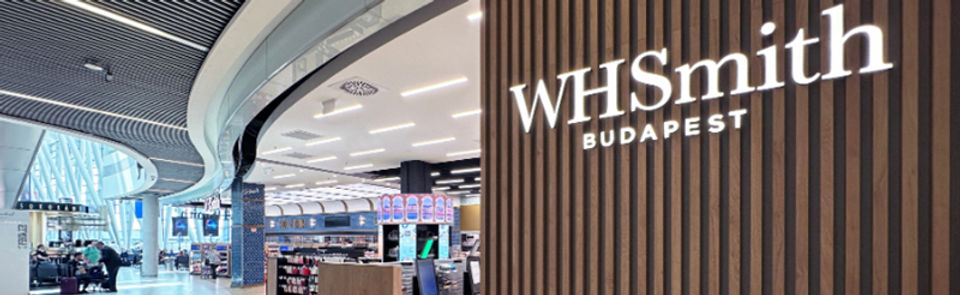
The visual identity work was refined rather than replaced. The iconic word-mark was preserved and strengthened — the most valuable asset the brand owned — while the supporting visual system was modernised to feel contemporary across digital, retail, and travel environments. The tagline "Trusted Quality, Every Time" anchored the renewed brand promise in language that was simple, direct, and earned.
* Brand strategy framework · Audience segmentation · Mission statement development
* New brand identity — word-mark refinement · Visual system · Application across retail and digital
The change
The rebrand delivered a WHSmith that looked and felt like itself again — not a brand trying to be something it wasn't, and not a brand retreating into nostalgia. The refined word-mark system gave the brand a visual foundation strong enough to scale across retail stores, travel environments, e-commerce, and digital channels without losing coherence.
Strategically, the work established something more durable than a new logo: a clear brand positioning, a defined audience framework, and a mission statement that gave the internal team a consistent filter for every future creative and commercial decision. When a brand knows precisely who it is for and what it stands for, every touchpoint becomes easier to get right.
In a category where competitors like Waterstones and The Works are sharpening their positioning, WHSmith now has a brand strategy built on its greatest asset — 230 years of earned trust — rather than in spite of it.
230 yrs
of heritage leveraged
3
audience segments defined
£1.75bn
brand at stake
1
clear brand mission


